The Elements of Good Health (and Design).
Just finished up my health food store project last week with a fantastic grand opening, ribbon cutting and outpouring of support from the community for my client’s new business and my design. It’s so rewarding to see clients happy after several months of designing, construction, intense periods of decision making and financial stress, laced with fear, doubt and questions about if their business will work or not. It’s more exhausting than people realize.
When I was approached about this project, I almost didn’t take it at first. The Patels had seen my Tiny Bubbles project and contacted me, and I thought, I’ll at least meet with them and see what they have to say. In the meantime, my mind began pondering, how great can one really make (what essentially boils down to grocery store) look, and how can I really change the way it functions and feels, and should I? Ultimately, stores of this nature are set up in rows to make navigating with a cart easier, as well as identifying the products one wants to purchase. Changing that doesn’t make sense. Speed is key to circulate around, spot things quickly and get out. For those who do like to linger, read labels, and learn about new products, that needs to be possible, too.
After meeting with them, hearing their vision and passion for a neighborhood health food store, I decided to take the project. I knew it would be an opportunity to have a completely different project in my portfolio and was excited about the opportunity to challenge myself in different ways and see what we could do with the wayfinding and in-store messaging, along with the challenge of trying to make a grocery store as experiential as possible. Larger grocery stores are now trying to do this, as well, by including bars in the their stores where customers can sample craft beer, for example. I knew the juice bar would be the heartbeat of the store, a dynamic place where neighbors could congregate and chat about food and healthy living, while sampling fresh juice.
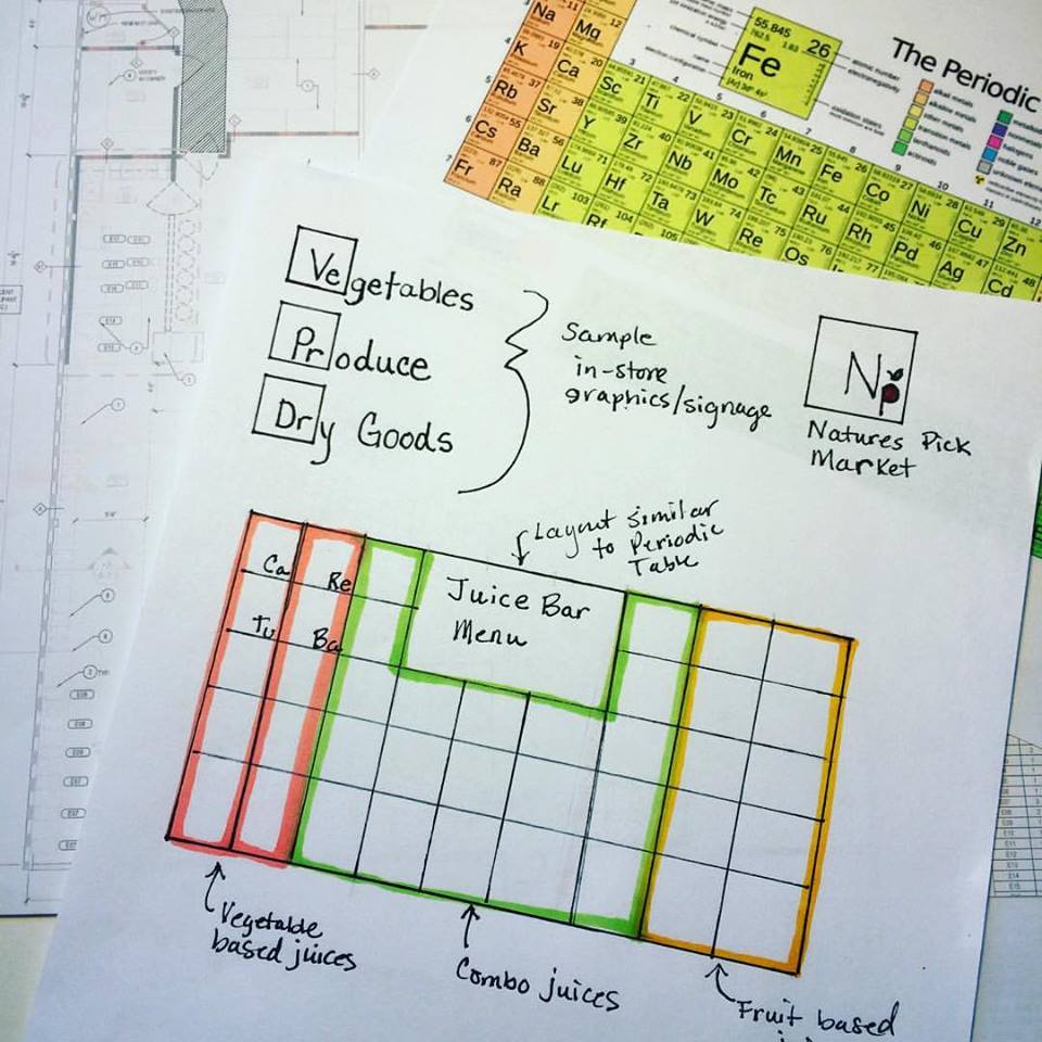
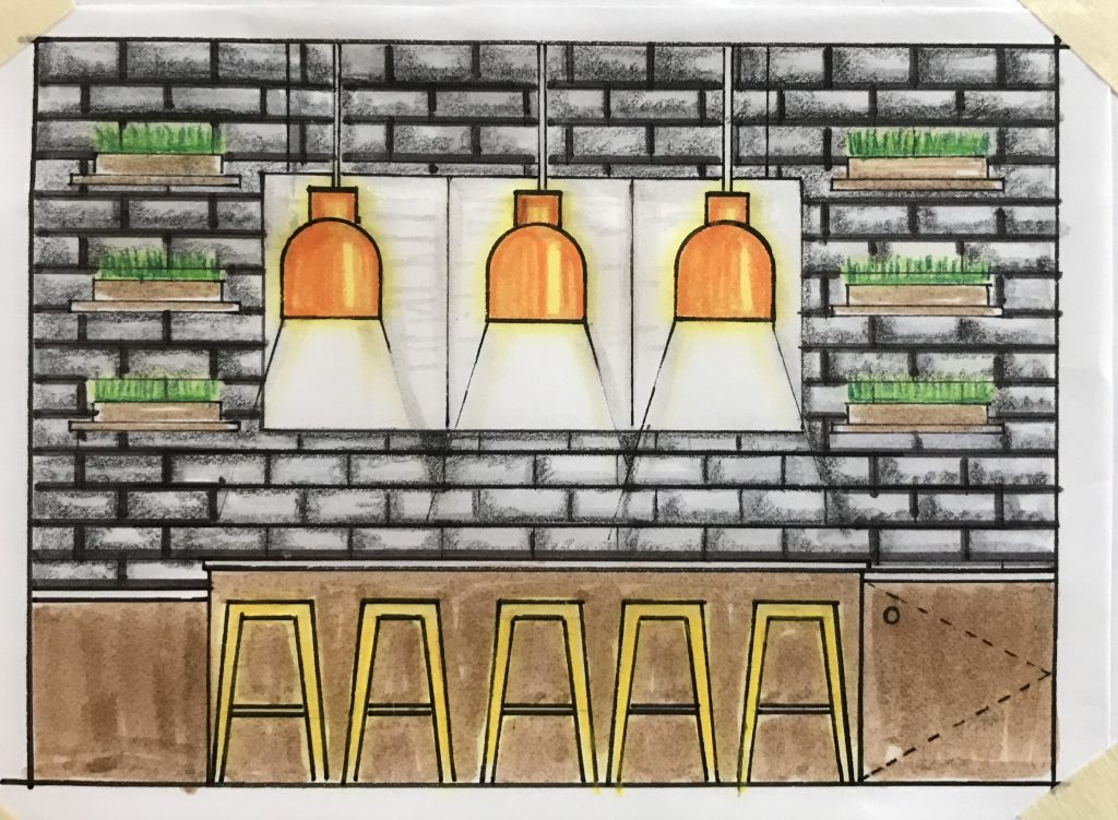
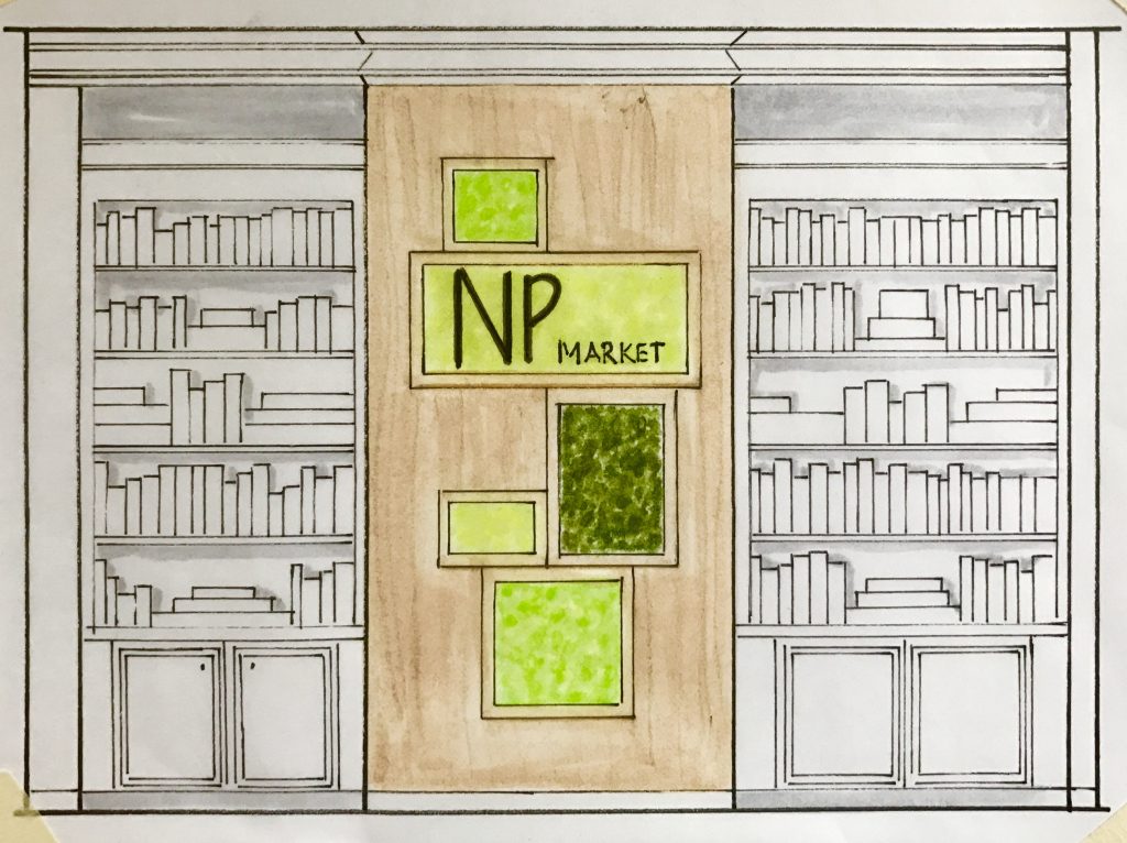
After researching health food stores all over the world and trying to think of a tagline, I kept coming back to a very clean look and feel. I wanted to avoid the farmhouse chalkboard look I had seen everywhere. I played with several words about health food stores, what it means to live a healthy lifestyle, and the basic building blocks of good health. The Elements of Good Health stuck. It meant for me, the store would carry all of the essential elements for creating a healthy lifestyle, the basic building blocks of natural, simple, good food and clean products. The design should reflect that as well. This led me to the Periodic Table of Elements and this initial sketch for a logo and possible menu idea (below). I also knew I wanted to focus on produce colors as accents, so orange, yellow and green would be the palette and a way of visually dividing parts of the store, if needed. Interior concept sketches below (click to enlarge).


However, I am not a graphic designer and knew with all the in-store signage, juice bar menu, product signage and more, if it was going to be done right, we needed someone on this team in that discipline. My clients agreed and hired Zenith Design Group. Several meetings between myself and Bonnie at Zenith produced a similar thought process, aesthetic and approach to how we would create a strong cohesive look between the two of us. I shared ideas I had for the interior, and she shared ideas she had for the graphics. We would each alter our piece of the puzzle a bit, until we had a unified look throughout, making changes and decisions based on what the other had in mind. The process was seamless. I showed her the initial sketch I had created for the logo and the juice bar menu, and she pulled it all together with this logo below. Exactly what I wanted it to be. Simple like the food in the store while still carrying that Periodic Table feel with the square shape and block letters.

The store itself would be three separate spaces combined with an elevation change. Two storefronts were at the same elevation and same ceiling height, while the other one was lower, which called for a long ramp. Initially the ramp was a concern of mine, because of the length and size required by code, but in the end, it didn’t feel like such a massive element after all.
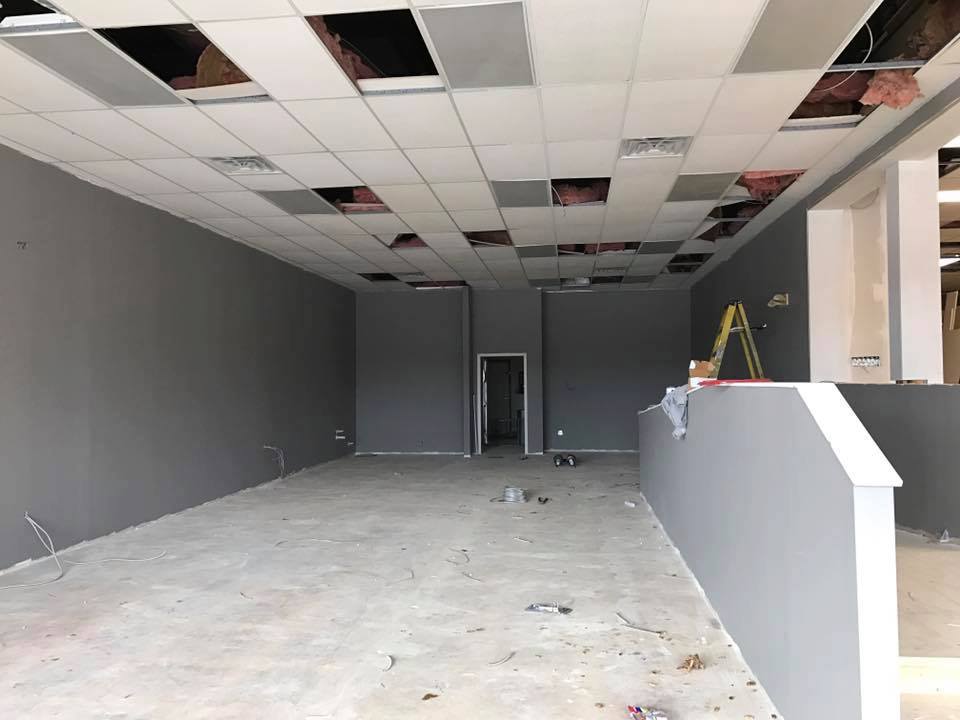
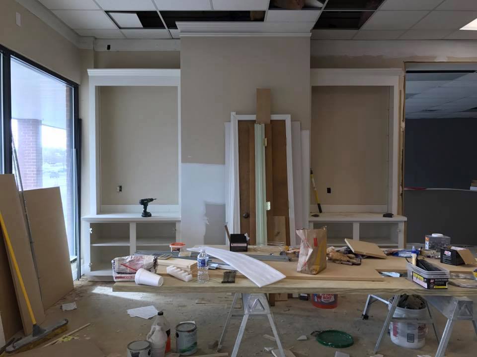
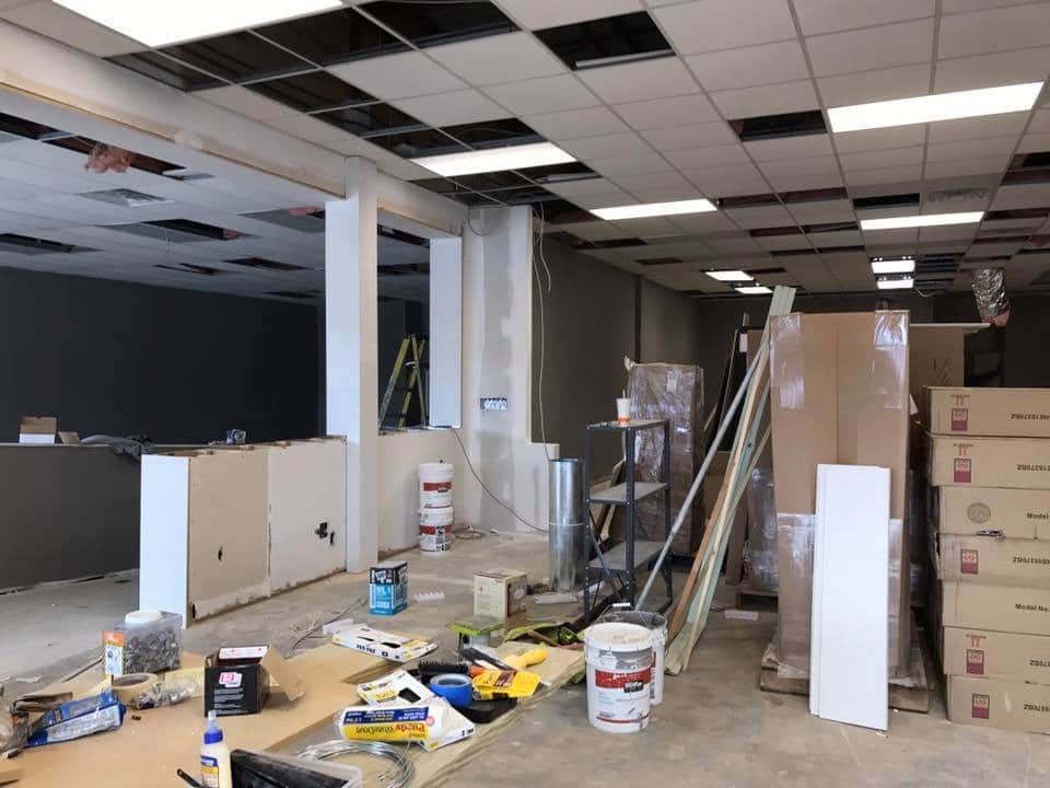
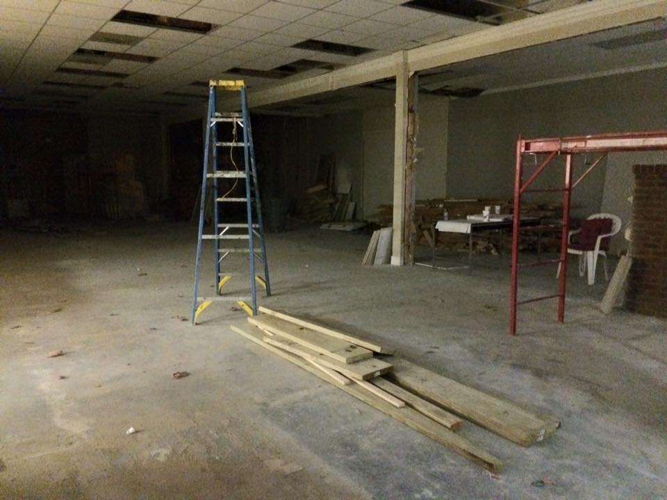
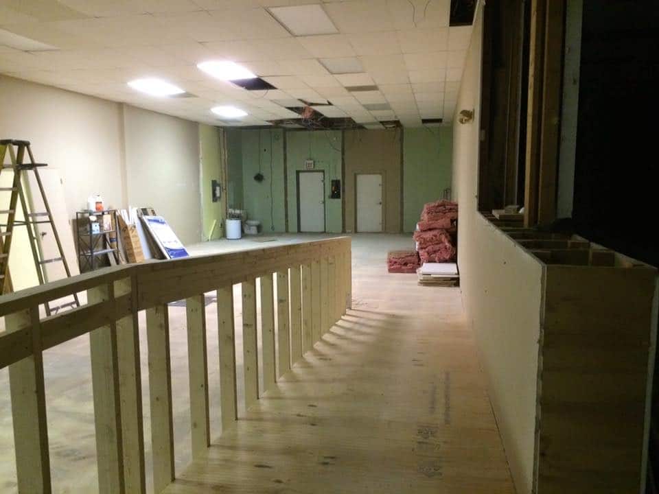
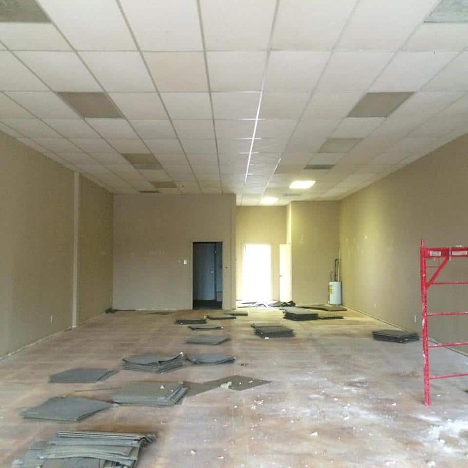
Below are some initial pics of the spaces, along with construction pics. You can see the ramp going in and the area behind the cash wrap opening up. One of the spaces was a flooring showroom, so when we first went in, there was a fireplace in the wall between the bookcases. My clients knew they wanted to sell books eventually and asked if we could leave the bookcases. We closed up the fireplace and this would become a space where people could sit at a table, thumb through books or nibble on a snack.
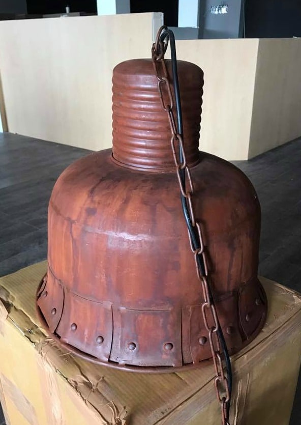
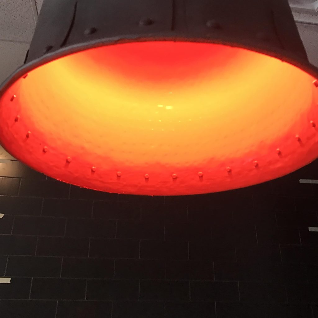
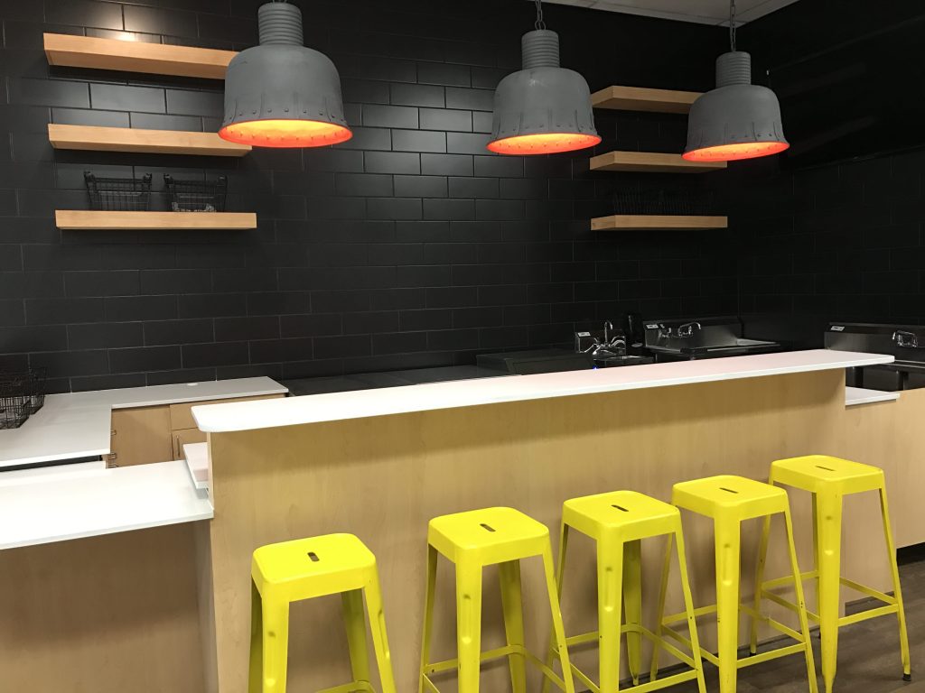
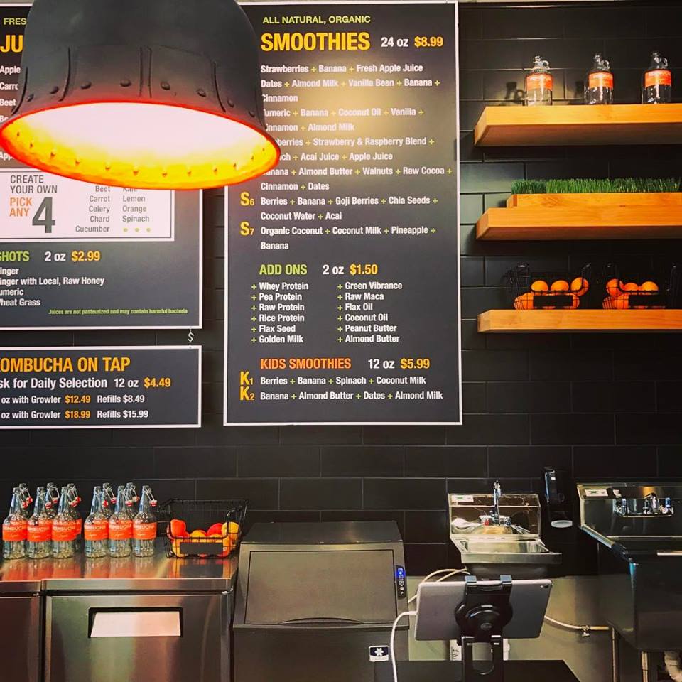
One of my favorite things is the juice bar lights. In the original sketches I did above, I selected large, orange, industrial pendants to hang over the bar. Unfortunately, they were too pricey for the budget. Instead, I bought these industrial, bell-shaped pendants which were handmade by artisans in Turkey. We painted the outside dark grey and the inside the color of a naval orange. I loved the original finish on the pendants but thought painting them brought out the orange from the inside even more. It also made more sense with the clean look. They cast a nice warm glow down on the bar, which was an unexpected little treat.
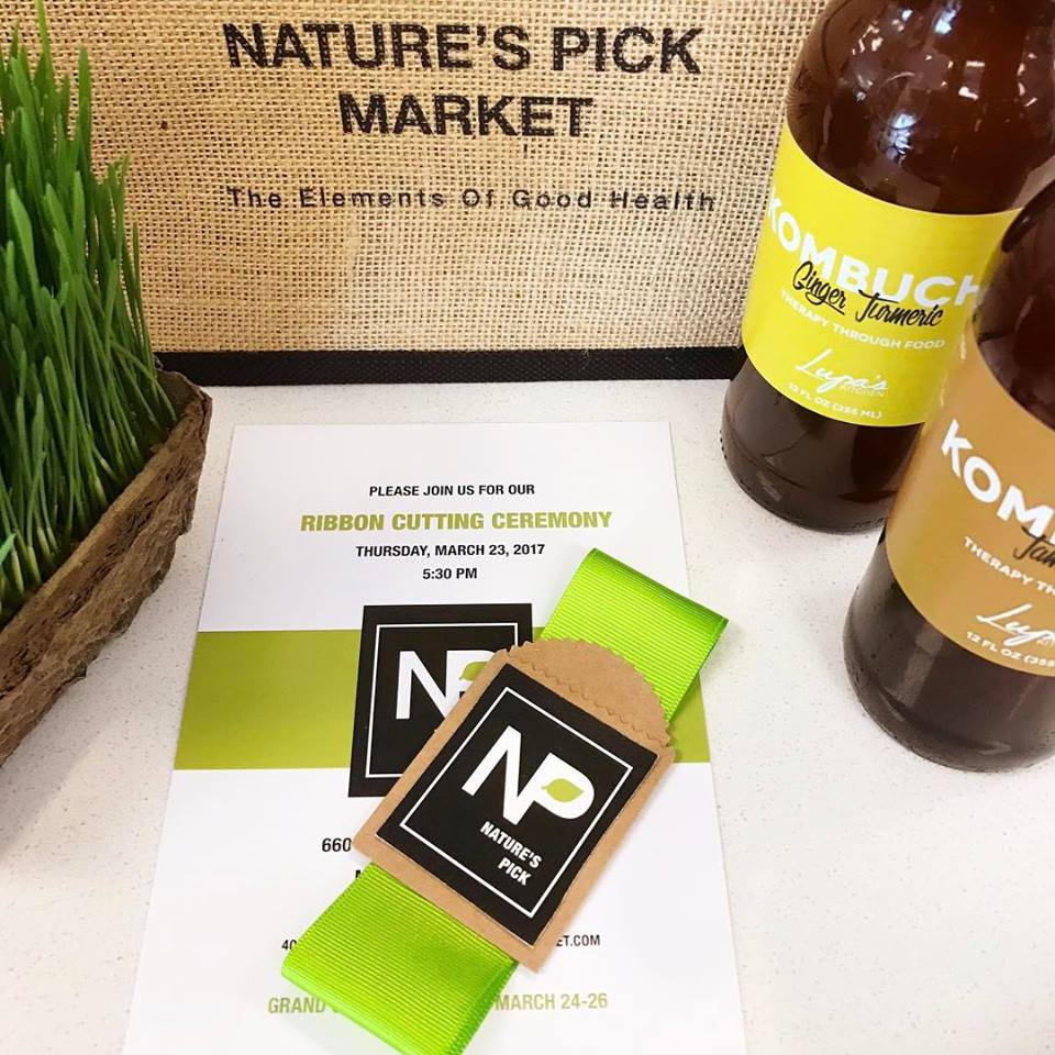
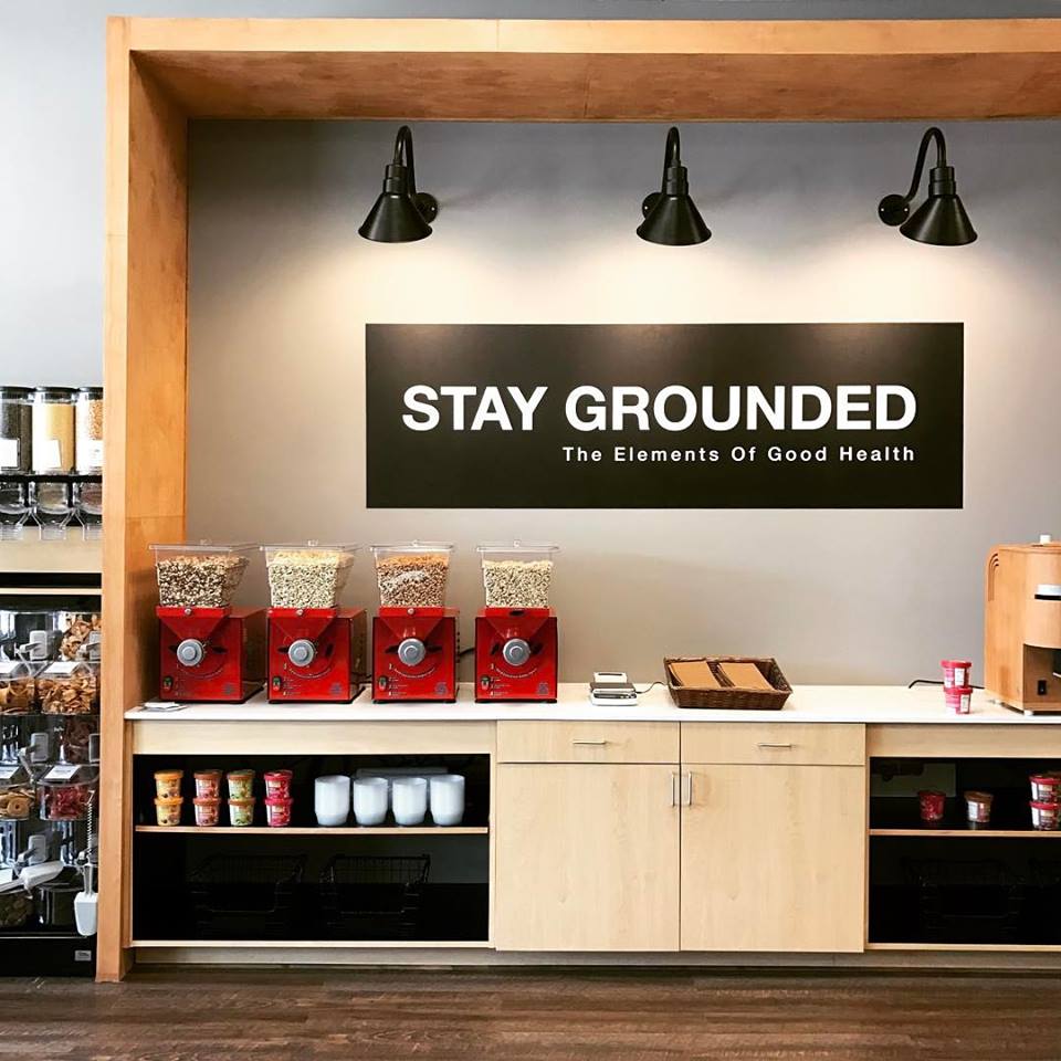
For the grand opening, Zenith sent a small piece of ribbon along with the invitation to the ribbon cutting to each person invited. Such a great first impression with huge impact. Below are a few pictures I took. You can see little snippets of the space and how they compare to the original sketches. The only thing different are the juice bar lights, grinding station lights, and the cash wrap lights (not pictured). I changed all of those during the construction phase. I really wanted the grinding station to be an area of its own emphasis. Grinding nut butters is a different task which involves containers and a self serve station. I surrounded it with a three-sided box to call it out visually and centrally on the wall, as well as to give it that self contained feeling. Grinding can be messy and I felt like extra light was needed here both for the task itself, but also to highlight the entire section and signage. Zenith came up with the clever phrase on the wall.
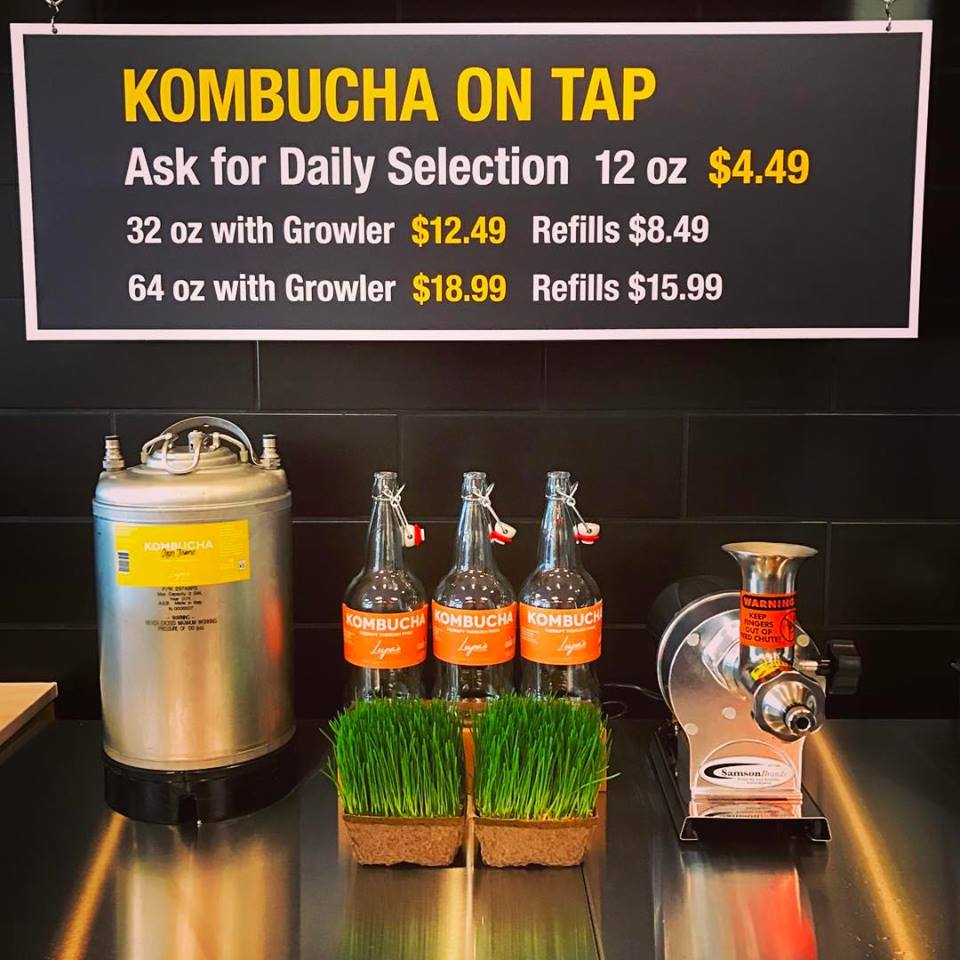
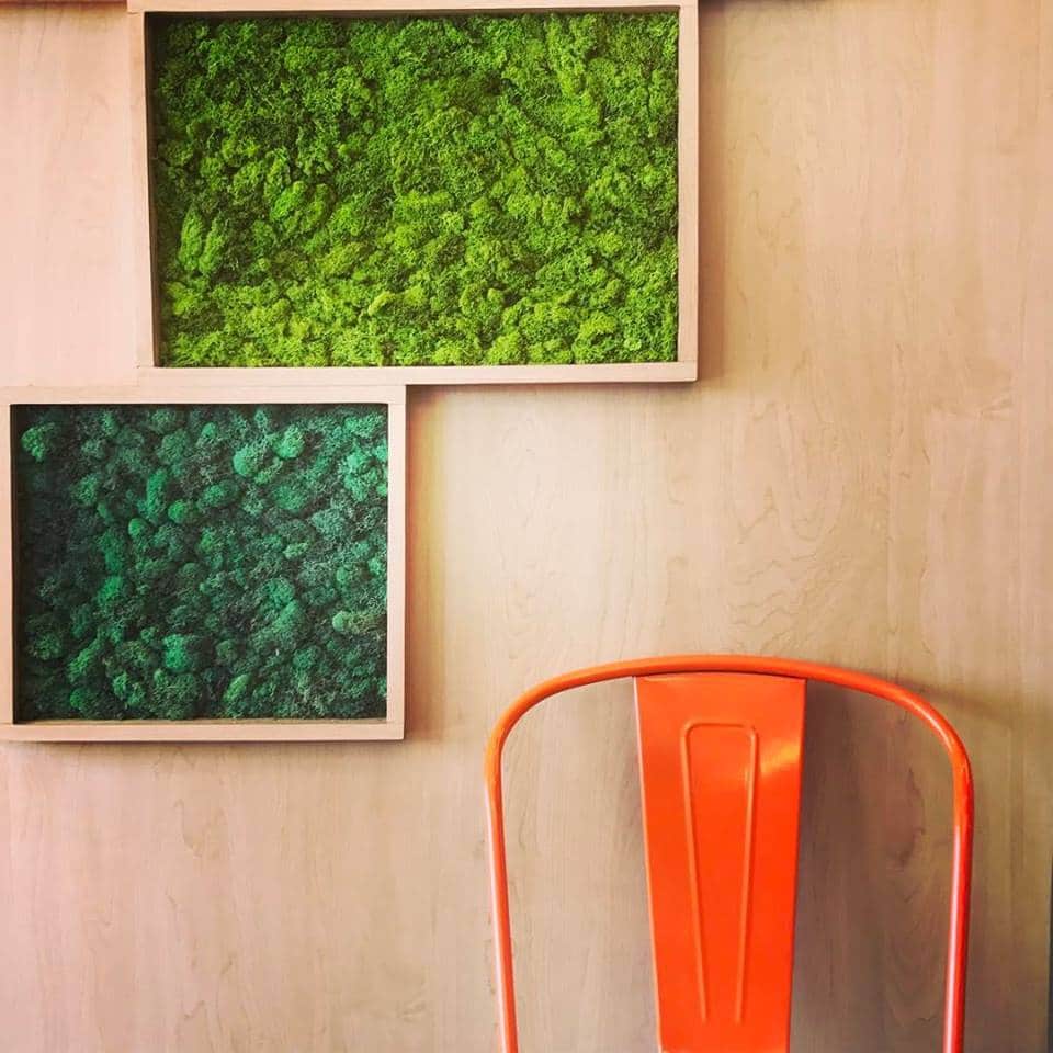
I wanted to use black tile in the juice bar, and when I first mentioned it, my clients raised their eyebrows. When you tell someone you want to cover something in black that is supposed to be bright and cheerful, it doesn’t seem right. I knew in this situation, the black would go away and all the colors of the fruit and vegetables would really stand out. That was the goal. If you look closely at the menu in the juice bar, you’ll see how Zenith took my original idea of using the Periodic Table of Elements as the menu and incorporated it in the menu item names, without copying the table. Referenced, not copied, is always the best way. The letters and numbers still have the same feel as elements in the table without being so literal. The black tile, black logo, and other black signage all tie the store together, as does the rest of the in-store signage. I also wanted to do a living wall, but the maintenance and cost prohibited it. Instead we built squares on the fireplace wall and filled them with reindeer moss, which ended up looking like broccoli once complete. I used light wood finishes to mimic the wood of produce crates and to balance all the black and luxury vinyl plank for the floors for functionality and durability.
I’ll share professional shots of the entire store once they are done. Thanks to my local friends who have been and said how much they love it. Your support always mean so much to me.
Xo,
Cassandra
