This 1960s ranch had low ceilings, limited light, and a poorly designed, inefficient floor plan.
Space planning:
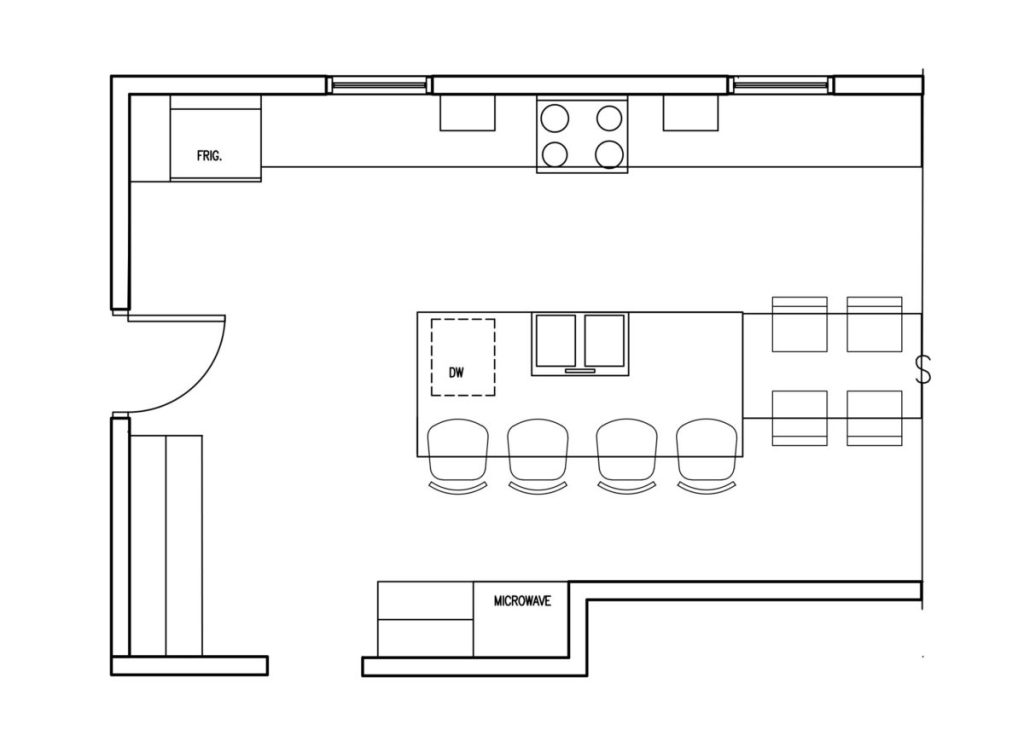
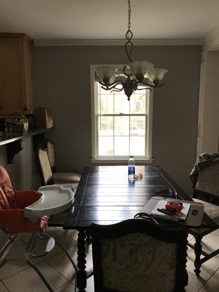
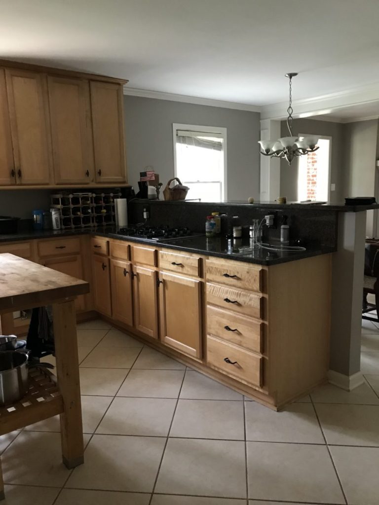
The main problem with the design of this kitchen was the peninsula. Peninsula kitchens almost always make a kitchen smaller, and I only use this design configuration as a last resort. In this scenario, the peninsula and raised bar (a thing of the past), cut the kitchen off physically and visually from the breakfast room, limited contiguous countertop space, and in the below pictures you can see how it’s dividing the room in half.
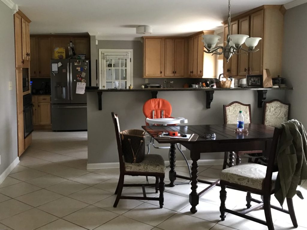
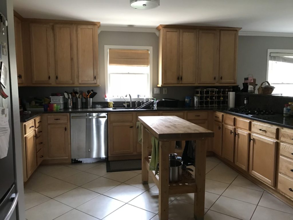
Several other problems existed:
- Bar seating wasn’t possible due to the limited space on the breakfast room side and conflicted with the breakfast room chairs, making the bar useless anyway.
- The refrigerator was too far out of the work triangle guidelines for kitchen design, making it very inefficient and creating more steps than necessary.
- The refrigerator was on the other side of the entry, crossing the circulation path from the laundry room, powder room, and garage studio/workshop.
- The wall next to the refrigerator further fragmented this section from the kitchen as a whole.
Design is not just trying to make spaces beautiful that are Pinterest or Instgram-worthy. Design is about making them more solution-oriented, so life is life easier, and one of those ways is by eliminating problem areas in the built environment.
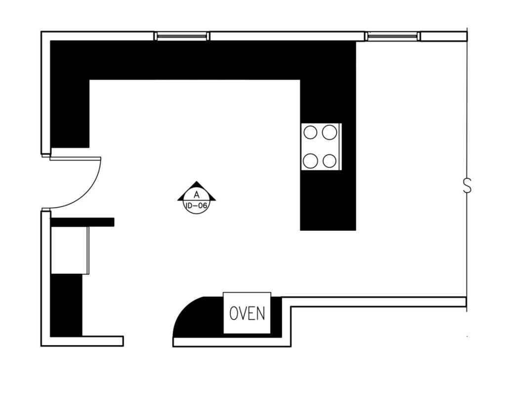
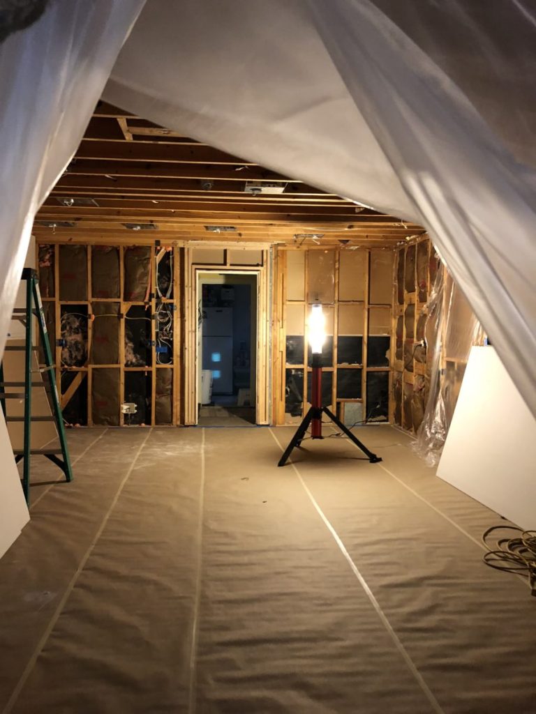
Imagine trying to carry a load of laundry from the laundry room or something heavy in from the garage studio/workshop while crossing the path of someone back and forth at the refrigerator trying to cook dinner. The previous plan prior to construction is below. Everything in black represents what was to be demolished, along with the new plan, and a construction pic of the space completely gutted.
Considering natural light:
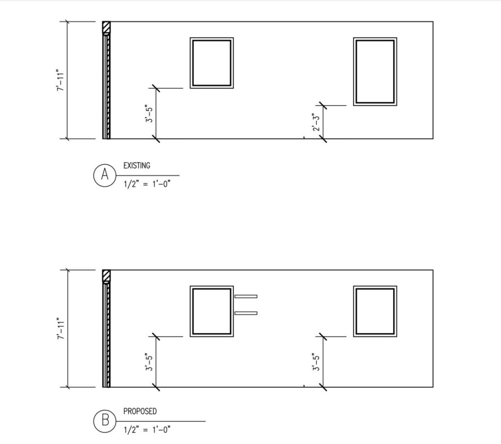
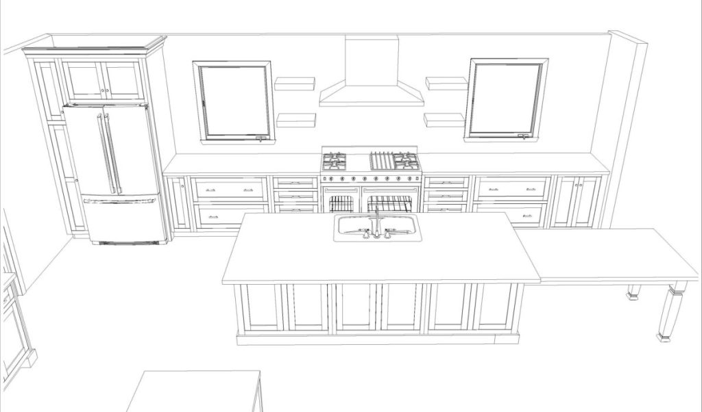
I almost never recommend diminishing the size of windows, but I knew we could make up for the lost light with brighter finishes to bounce and reflect the light around the room. You can see in the pre-construction pictures taken in the kitchen looking towards the breakfast room window, the bar blocked half of the light coming from that window anyway. By removing the peninsula and taller bar section, light could move around the space a little more. We took the two windows on the exterior wall, which were initially two different size, the smaller one over the sink, and the taller one in the breakfast room, and made them both the same size, allowing us to extend the base cabinets and counter top space all the way down. I always recommend when changing windows that clients go to casement windows. I have them and love them. On this project the client agreed and we switched both of the these to casements, so they can crank them open during beautiful weather. It makes all the difference and the clients are thoroughly enjoying them. I highly recommend fresh air and the ease of the casements. You’ll also see how I added the shelves in the drawing just to get an idea of scale and height in relationship to the window.

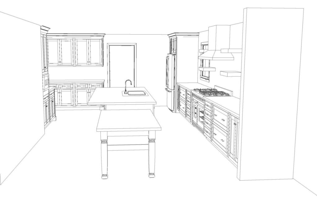
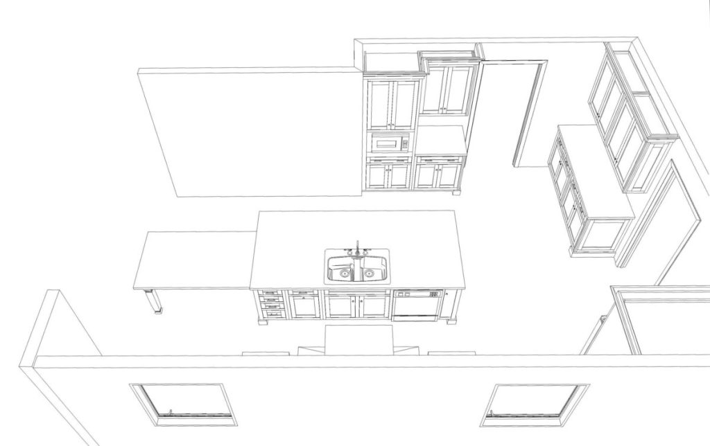
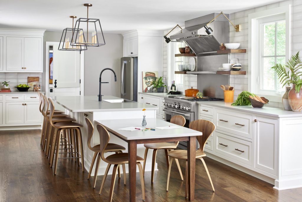
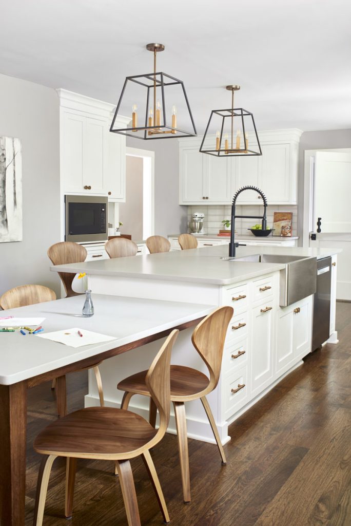
I rearranged the plan to include a larger island, lined everything up, and proposed the idea to remove the wall cabinets, add drawers below, move the refrigerator to the range wall, bringing it closer to the other main functions, add a tall pantry on the left side of the refrigerator and make the microwave cabinet section a little more functional, to include a coffee station with cups in the cabinet above. Although we lost upper cabinets, we did not lose in over linear feet or cubic feet of storage, and actually gained, since we extended the base cabinets and added a large island with storage on both the sink and new bar side. Below are design illustrations.
You can also see there was a wall at the end of the kitchen. Initially we discussed not removing it due to cost, having to finish the walls into the next room, also structural considerations, etc, and as with many projects, once we were into construction, things changed onsite, and the wall was eventually removed. It opened the room up even more to the keeping room.
Addressing appliances:
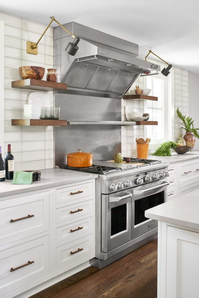
Prior to starting the project, the clients already had their desired range and hood selected, as they were seeking a more professional level kitchen. We designed everything around those specs. One of the main requests from the client was she wanted a table where they could all eat together and face each other, instead of just bar seating where they’d all be sitting in a line side by side. Not being able to fit it within the lines of the space and without it encroaching into the implied, visual lines of the breakfast room, we attached the table at the end of the island which also cut down on circulation space required. A freestanding table requires room to walk on all four sides. By attaching it to the island, we didn’t need circulation on the one side which saved on space, and thus kept it in line. We kept their refrigerator, as it was a fairly new purchase and moved it closer to the sink and range for better functionality and out of the path of entry, and purchased everything else new. We added custom shelves and accent lighting for quick grab items like glasses.
Secondary functions:
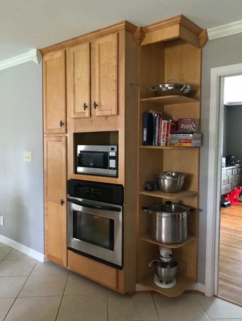
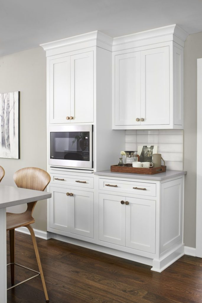
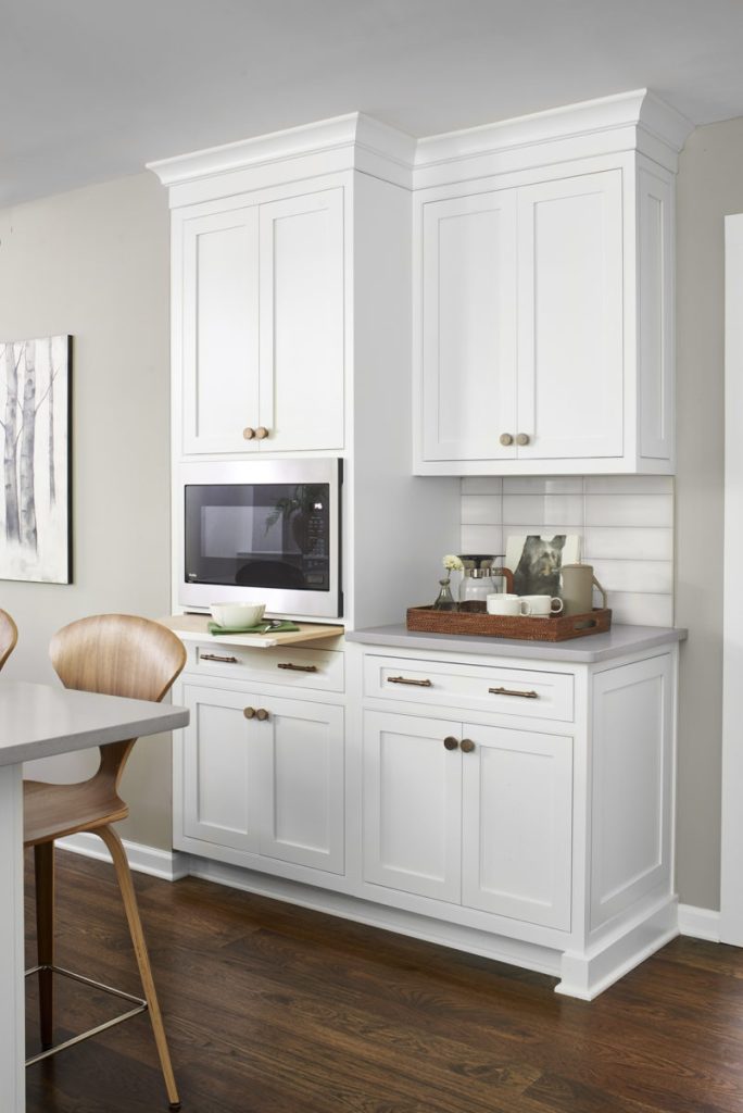
The microwave wall was redesigned to eliminate the second oven, which was no longer needed with the new larger range, added more functional cabinet space, a designated coffee station, and a great little detail like the slide out board below the microwave to make stirring dishes being microwaved a little more convenient and to add a little extra countertop space if a second dish is waiting to be microwaved. With the secondary functions, when possible, I like to locate those to another area of the kitchen like this. Again, limiting crossing paths is key. Someone cooking dinner doesn’t need to navigate around someone just heating something up. Same for coffee. Having designated areas away from main functions prevents families from crawling all over each other or crossing paths unnecessarily.
Point of entry:
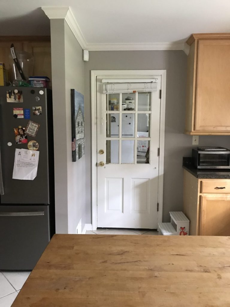
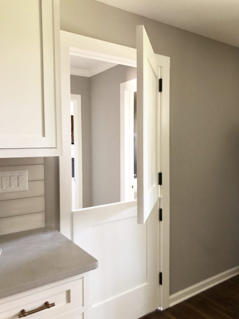
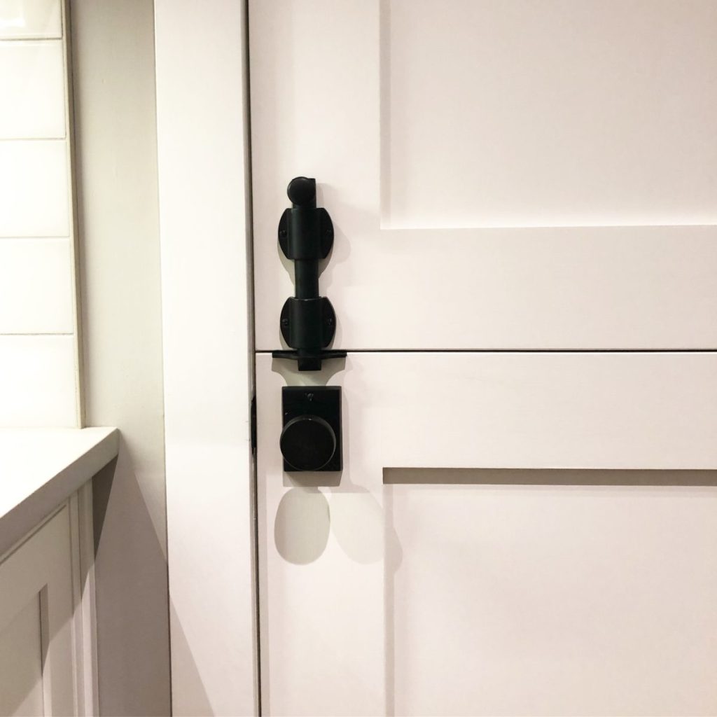
The clients also wanted to replace the door to the garage studio/workshop, the powder room, and laundry room. Just in the short amount of time I was there, I realized there was a better solution than just replacing it with a new door. With the constant shuffling of kids and dogs, and the need for them to be contained or separated at times, I proposed the idea for a Dutch door. Having the top half open would allow them to still communicate between all these rooms while at the same time, keeping the bottom half closed, allowed them to keep children and dogs contained in a desired room. They have commented how much they have used this door since the renovation, which I’m trilled to hear. Sometimes design solutions are marriage solutions, too. We’ve all tried yelling to our spouse through a closed door or trying to keep kids or dogs from barging in if we do have to open the door to talk. 😉 Here’s a close up of the door and after the hardware was installed.
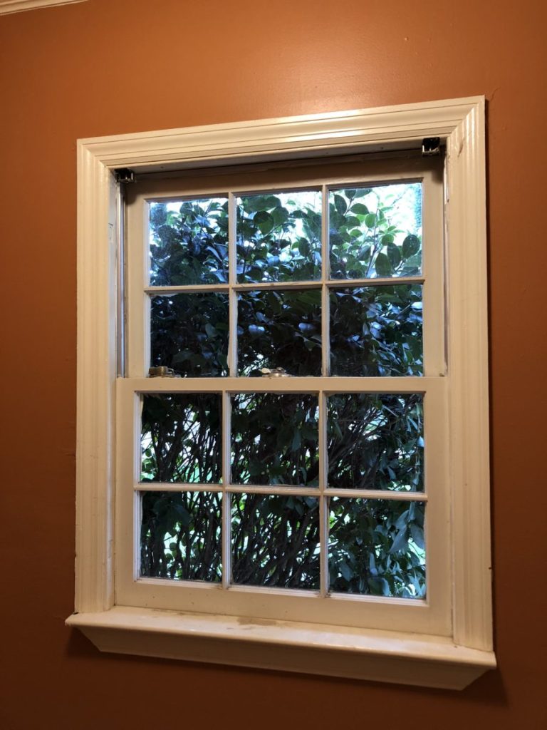
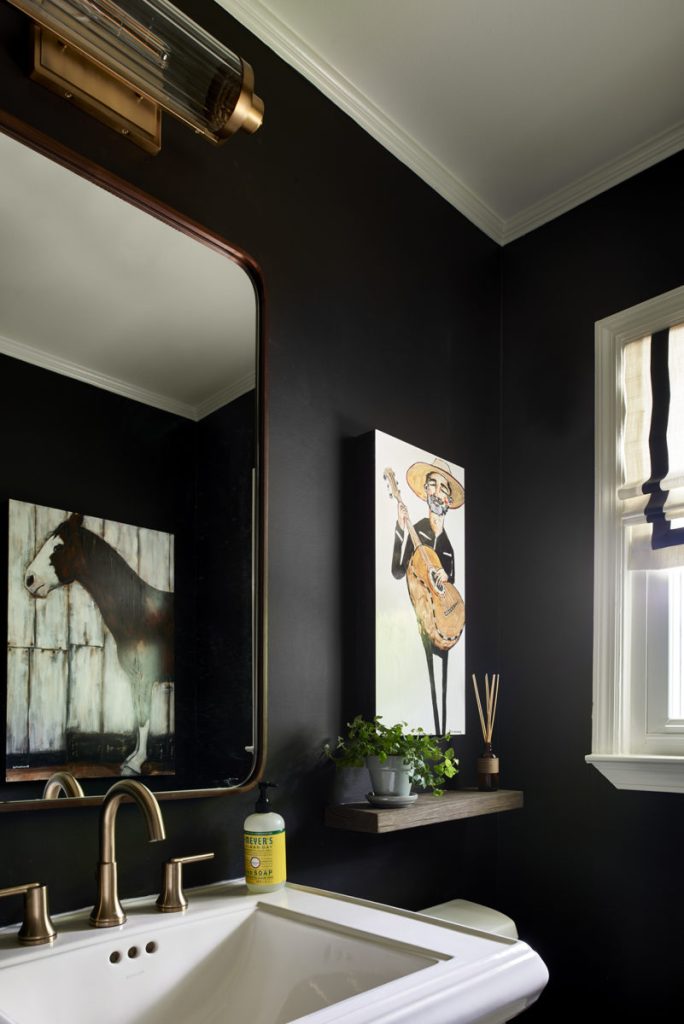
Lastly, the powder room needed some attention. This little space was a terracotta orange that needed some spark. With a plethora of the client’s art needing wall space, I thought we needed to showcase some of that in the powder room. When I mentioned painting it black, so we could create some high contrast and showcase the art inexpensively but dramatically, eyebrows raised initially, but they jumped in and agreed. Tiny powder rooms are so hard to photograph, but I’m including this picture I took of the window wall for a contractor, so you can see the before wall color and after with the black. There is a myth about dark colors making rooms small. I love how you can see the horse in the mirror. if you’d like to see more of the client’s art, you can visit her work at clairedunaway.com
Thanks so much for reading. If you have questions please let me know. If you’d like to chat about your kitchen, or any other residential or commercial projects, we can schedule a time for a one on one phone call.
xo,
Cassandra
Professional Photos: Marc Mauldin
